

Full Description
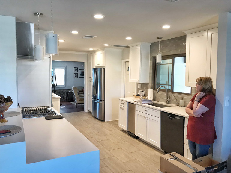
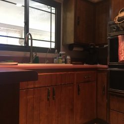
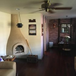
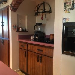
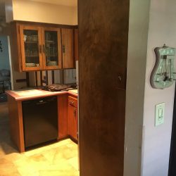
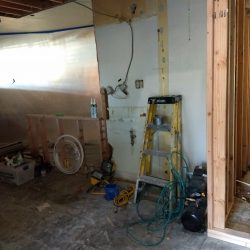
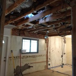
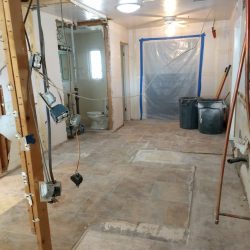
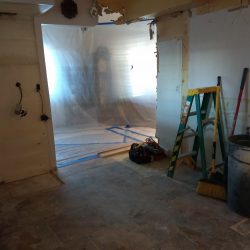
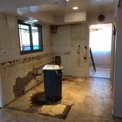
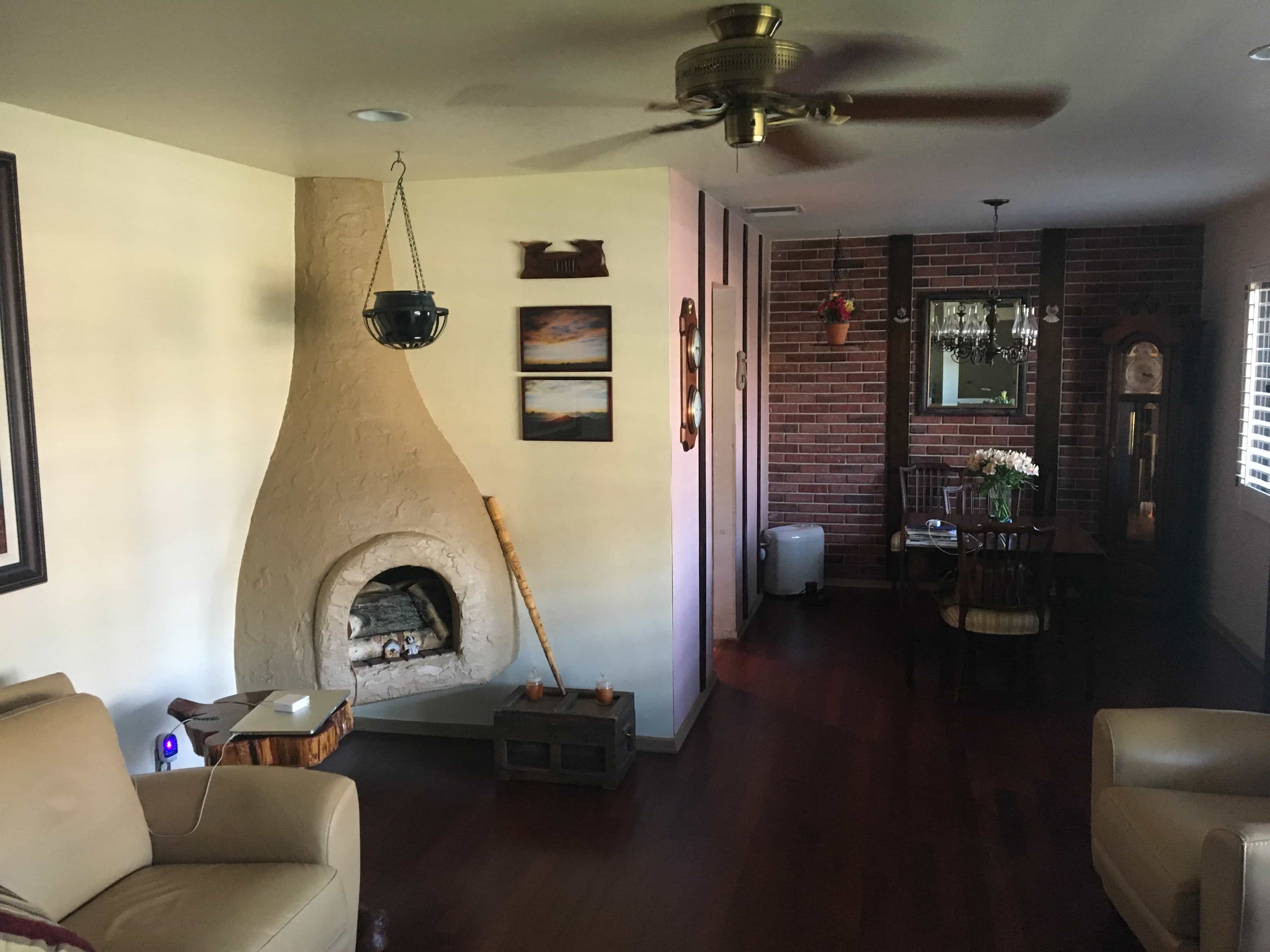
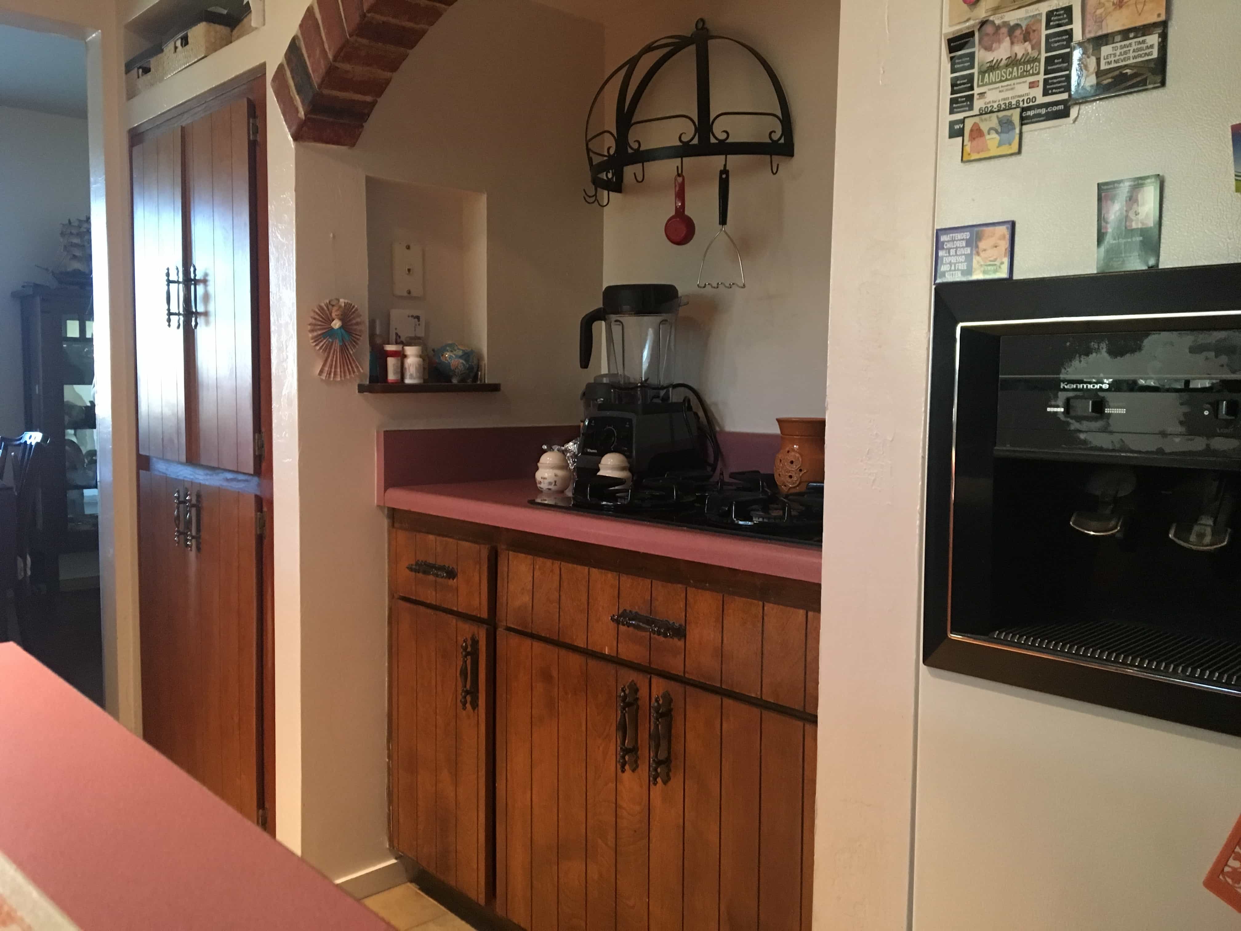
Here’s a transitional designed kitchen (see more on this décor style) . This is a house in the Historical district of Phoenix which meant it was really cool, but also really dated. It’s no surprise though because architects in the 40’s and 50’s thought a lot differently than architects today with regard to home layouts and kitchens. In this case, the home was very segmented…far too many walls, which made it feel small and dark, and the kitchen was very clearly designed with the “old” mindset: namely, it was built for a single person to occupy and use, not for full family entertainment.
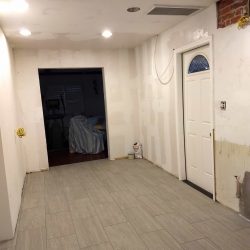
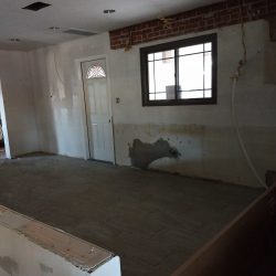
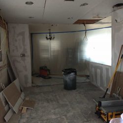
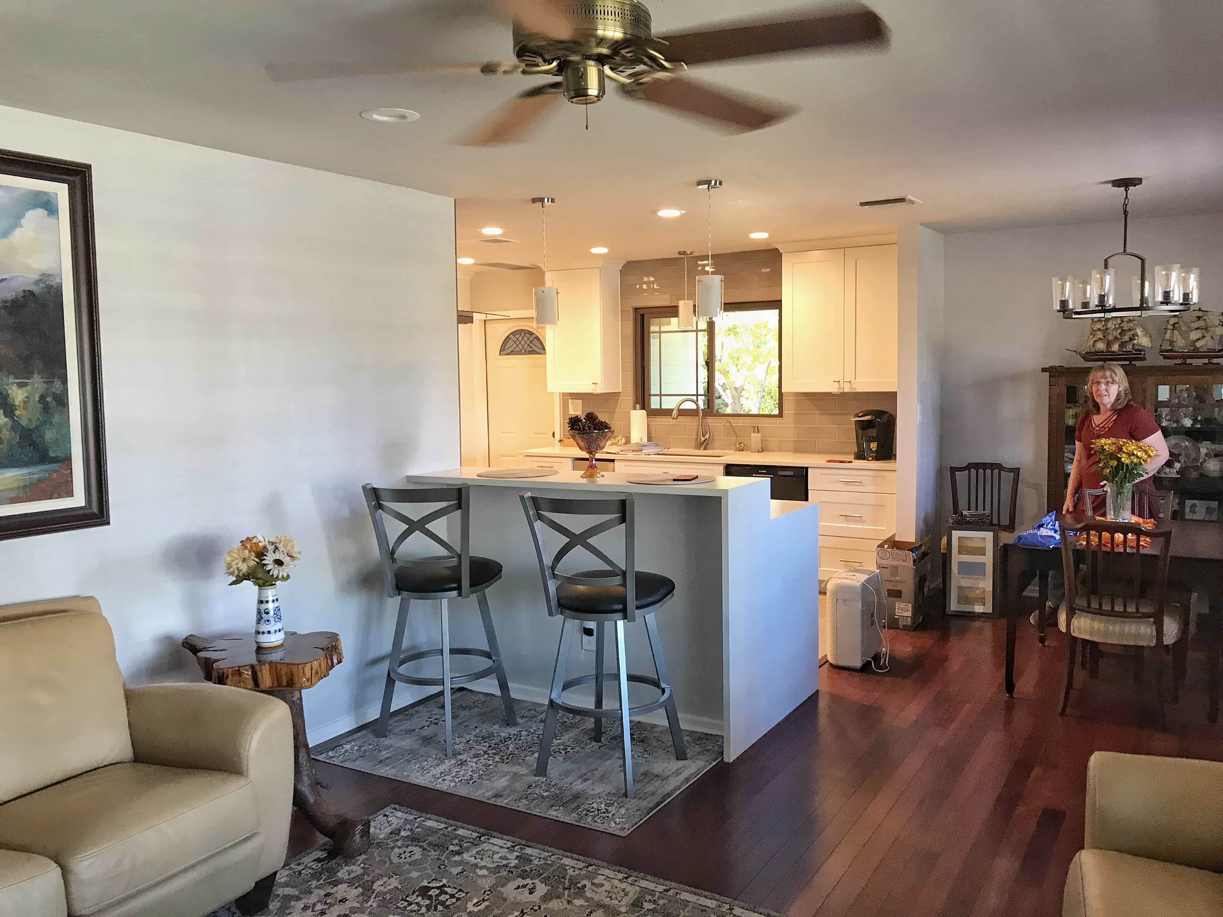
Our client’s first goal was to modernize the space. However, they, like most people we meet that say they want modern, actually wanted something “transitional.” In the simplest of terms, this meant they wanted an open, modernized space without having to commit to harsh lines, cold colors and the mechanical feel of a truly contemporary space. Once we opened things up by removing the unnecessary walls we had room to maneuver and rebuild. Here is what we did.
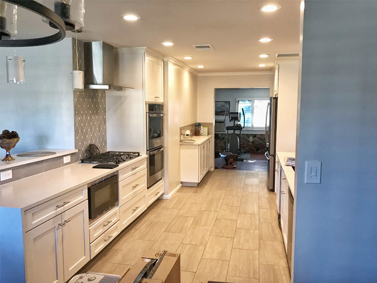
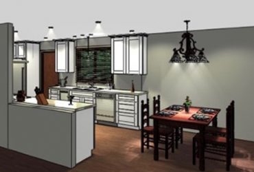
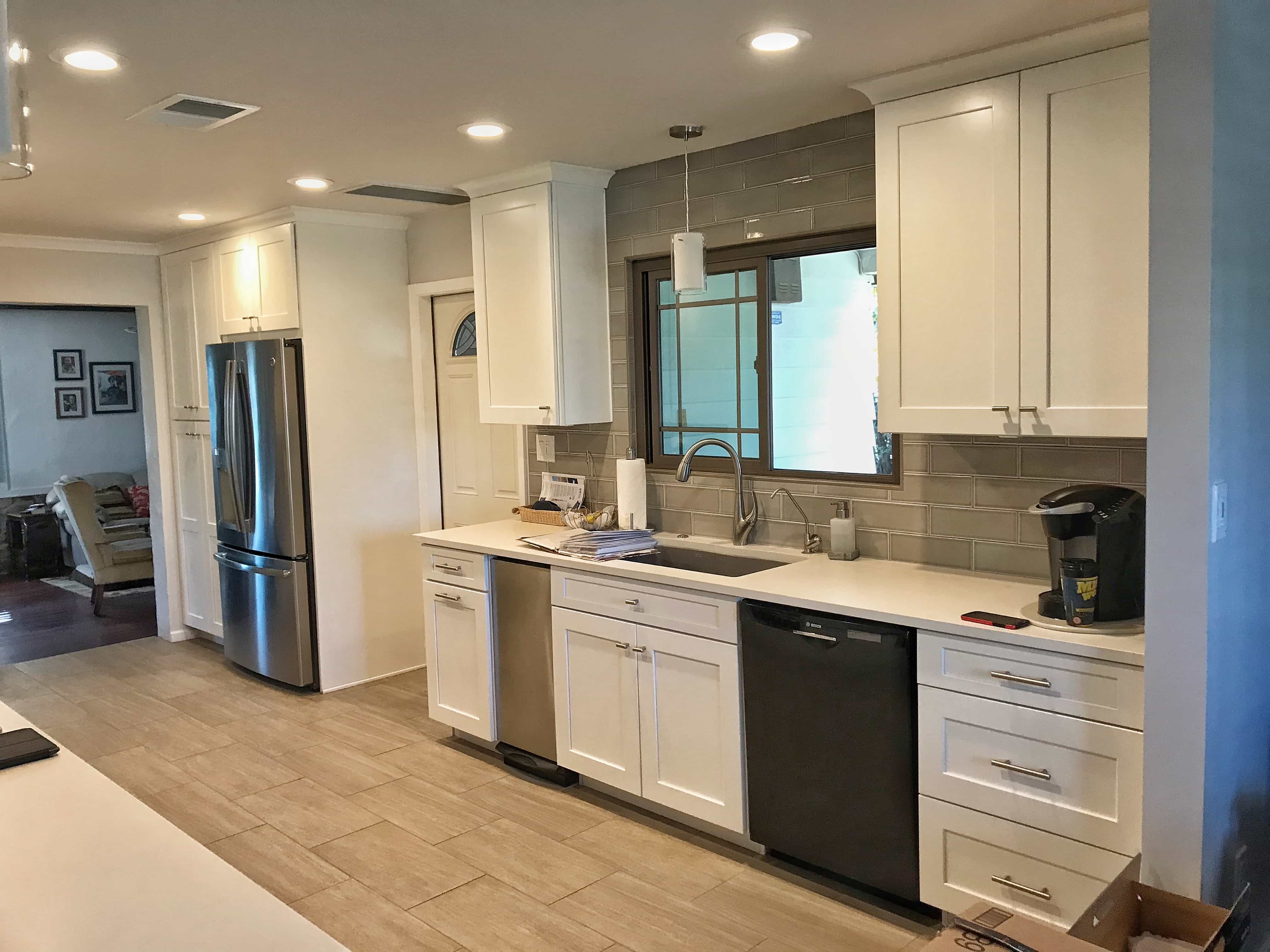
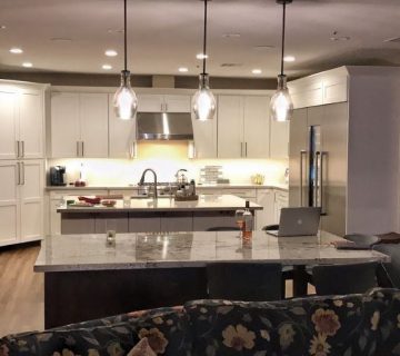
We used white shaker cabinets rising off of a bright white quartz countertop. We wanted these elements to blend so we could have a little more wiggle room on the backsplash. The floors are porcelain that looks like wood, laid with minimal grout lines. The backsplash is a translucent shark grey 8×4 glass subway tile. The grey in the backsplash and floors provides the contrast needed against the white cabinets and countertops. Please call us at 480-650-4402 with any questions regarding specific materials. Thank you.
Why
They owned a house in the historical district of Phoenix that they having been waiting and saving to update. Their goals were as follows: open up and modernize the space, connect all the areas of the home together cohesively, improve their kitchen design, workspace and layout, and finally, to design everything around blending the Cherry wood floors throughout the rest of the home.
How To Start
They knew they wanted an open, more modern space which meant they knew they liked lighter colors. Also, they knew they wanted to keep their cherry wood floors, so we had a “constant” to consider in the planning stages. The first step was to show them how to maximize the layout of the entire house by knocking out a few unnecessary walls. Once they saw the potential of the space, filling it with beautiful new design materials was easy.
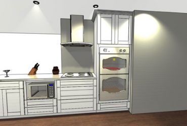
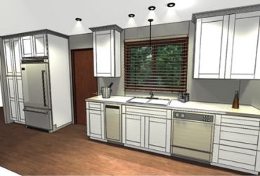
Virtual Walkthrough Created by Josh Hunt of Hunt’s Kitchen Designs
Our Process
Identify Constants & Changes – The constant on this project were the cherry wood floors. The kitchen floors were being replaced, but all replacements needed to match the wood floors throughout the rest of the home. Potential changes included: the cabinets, the countertops, the backsplash and floors in the kitchen and all bathrooms
Define Style Genre & Design Preferences – Once again, we use two simple questions to narrow this down. 1. Which cabinet door do you like? 2. Pick a cabinet color. These two things tell me most of what I need to know to design the entire space. In their case it was clear that we would be using a lighter color palette on a Transitional Design.
Build a Design Board – They picked a white shaker cabinet door and color. From here we used these two choices to narrow down the floors. We knew we wanted a wood-looking porcelain, we just needed to find the right one. Last comes the backsplash. We recommend leaving this as the last decision because it’s infinitely easier to decide when you have every other element to compare against. The grey 8×4 subway tile was the clear winner.
Do the Design – We know we want modern, we know we want open, we know we want lighter colors, we know it has to blend with cherry wood, we know it has to connect with the rest of the house, we knew they wanted to be able to entertain. Now it’s just a matter of delivering on these promises.
Virtual Walkthrough – When they came back in we were able to show them a design that accomplished all of their goals while still remaining inside of their prescribed budget.
Conclusion
We have a saying, “we go for the trifecta.” The trifecta is: the right design, for the right price, with the right people. The first two are obvious, of course you need to like the design and the price before moving forward, but liking the people is just as important. A kitchen remodel can be a war and you’d better like who you go into battle with. For the Kolar Project we are happy to report we hit the trifecta. They loved the new space, they loved the price and we were all still friends when the project was finished. Nailed it!

No comment