Full Description
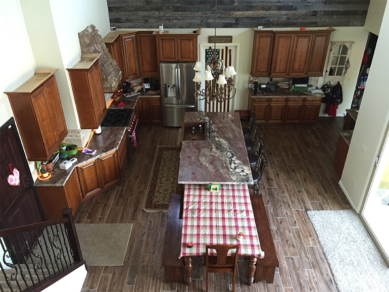
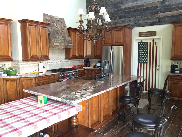
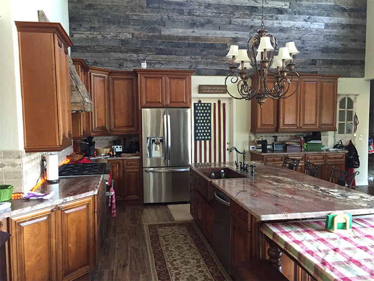
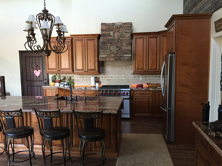
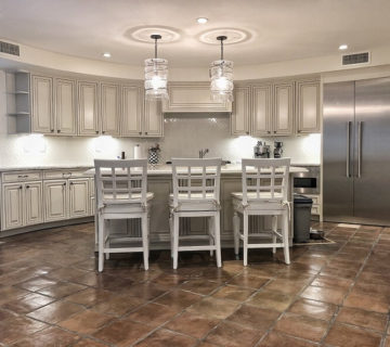
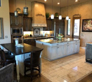
Traditional kitchen design. Raised panel, Delaware door with a rustic stain and black glaze. The countertops are granite. The floors are wood-looking porcelain and the backsplash is a travertine pattern. All of this is set against the back drop of the main wall which is covered in reclaimed barn wood…hence the project name: Barnwood.
Why
The main motivation for this project was updates. The home was built in the 2000’s with an open concept so the bones we had to work with were wonderful. All the home needed was a face lift. Along with the facelift we improved the layout and function of the kitchen, including a stone pizza oven on the wall to the left of the fridge.
How To Start
Our clients discovered the barn wood sort of by accident. They bought it all and had been sitting on it waiting for an opportunity to use it. The other thing they knew they wanted for sure was a stone pizza oven. They entertained constantly and loved cooking pizza. Whatever we did needed to incorporate the barn wood while blending the rest of the home.
Our Process
Identify Constants & Changes – The constant was the barn wood. We knew it needed to be incorporated into the design somehow. The changes were everything else: cabinets, countertops, floors and backsplash.
Define Style Genre & Design Preferences – As stated above this was a Traditional Style Kitchen Design.
Build a Design Board – They picked a white shaker cabinet door and color. From here we used these two choices to narrow down the floors. We knew we wanted a wood-looking porcelain, we just needed to find the right one. Last comes the backsplash. We recommend leaving this as the last decision because it’s infinitely easier to decide when you have every other element to compare against. The grey 8×4 subway tile was the clear winner.
Do the Design – We know we want modern, we know we want open, we know we want lighter colors, we know it has to blend with cherry wood, we know it has to connect with the rest of the house, we knew they wanted to be able to entertain. Now it’s just a matter of delivering on these promises.
Virtual Walkthrough – When they came back in we were able to show them a design that accomplished all of their goals while still remaining inside of their prescribed budget.
Conclusion
We have a saying, “we go for the trifecta.” The trifecta is: the right design, for the right price, with the right people. The first two are obvious, of course you need to like the design and the price before moving forward, but liking the people is just as important. A kitchen remodel can be a war and you’d better like who you go into battle with. For the Kolar Project we are happy to report we hit the trifecta. They loved the new space, they loved the price and we were all still friends when the project was finished. Nailed it!


No comment