Last updated on January 15th, 2025 at 07:56 pm
What is Modern Design?
Modern design originated in Europe after the destruction of World War I. Much of the pre-war world was destroyed, some literally in the continent-spanning war, but also figuratively, in that many of the ideas that predated the Great War seemed absurd and outdated in the face of the war’s devastation. New schools, especially the Bauhaus in Germany, brought new ideas to design.

A core concept is the idea of “starting from zero”, where designers put away old ideas about what buildings and furniture should look like, and focus on what could be produced with contemporary materials. They also focused on minimalism, stripping away the ornamentation and taking a design down to its basic utilitarian function.
How is Contemporary Design Different from Modern Design?
Contemporary design follows on the ideas of the Modern style, often featuring Modern elements like lack of ornamentation and celebration of man-made materials. Just as Modern design emphasized what could be made with the industrial materials of the 20th century, Contemporary design looks at the industrial materials of the 21st century. Contemporary kitchen design also commonly blends modern ideas with other styles, like the farmhouse or Mediterranean styles, to create interesting hybrid concepts. Enter the transitional kitchen décor style; if you were to take a 50/50 mix of contemporary and modern kitchen design styles and blend them together at a ratio of 1:1, you’d end up with transitional. The transitional kitchen is among the most popular kitchen design style since 2016 and it shows no signs of slowing down.
What About Mid-Century Modern?
Check Out This Particularly Iconic Modern Style
European Modernism filtered its way over to America over the course of the 20th century. Mid-Century Modernism is an American interior design style that developed in the period following World War II. It combines Modern ideas about minimalism and emphasis of man-made materials, Scandinavian design’s love of simplicity and natural shapes, and American post-war optimism. In contrast to the more austere Modernist looks, Mid-Century Modern interior design shows off the flourishes that are inherently possible in 1950s industrial materials.

Mid-Century Modern homes are by far the most iconic form of modern style homes and might just be the most fun to recreate.
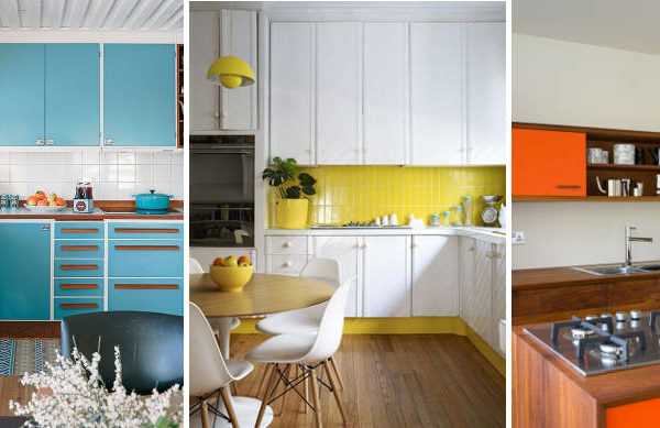
Mid-Century Modern kitchens are often bold, featuring bright colors in the cabinet, backsplash, or wallpaper. Wood paneling is common too, showing off the possibilities of plywood. Look for furniture in the style as well, like the famous Tulip chair. Cabinets are often wood, if not some bright, cheery color. A backsplash is a bright and bold color, as is the wallpaper; you don’t see wallpaper very often in more-contemporary homes, but it’s huge in Mid-Century Modern.
Mid-Century homes also tend to make heavy use of modern furniture, designed to complement the wooden paneling or bright colors in the home – whether it’s colorful barstools, the famed Tulip Chair, or a bright red vinyl couch in the breakfast nook (like diner style). The home’s overall design is usually made to be open, airy, and flow altogether, perhaps even blending in with the world around it.
If you’re looking for a kitchen that is stylish, unique and colorful, you can’t go wrong with a Mid-Century interior design.
Elements of the Modern Kitchen
There’s always room for your personal touch, but if you want a Modern kitchen, look at these core elements for the best Modern kitchen ideas. You can also check out our article on ‘Trending Modern Kitchen Ideas‘.
Man-Made Materials
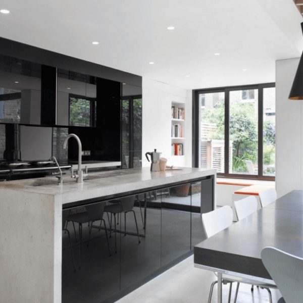
Where the Rustic kitchen loves the natural beauty of wood and stone, the Modern kitchen lavishes affection on man-made materials like stainless steel, glass, laminates, and ceramics. Sleek and shiny is the name of the game, and while natural materials can add a counterpoint, the focus should stay on the wonders of the industrial age.
Think laminate, stainless steel and chrome – not wood paneling or brick. Ceramics and even plastics sometimes make their way into the game.
Minimalism is King
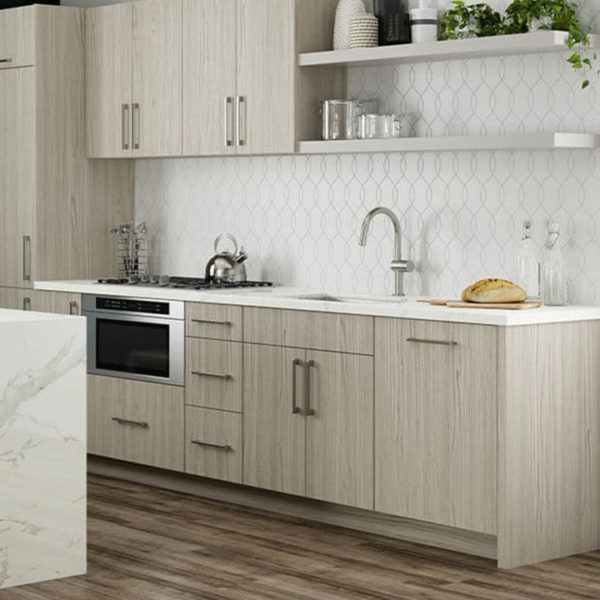
Take away the ornamentation and focus on the core functionality of your kitchen elements. Clean, simple lines rule in a Modern kitchen. Take a look at frameless cabinets and smooth round pull handles.
Stainless Steel
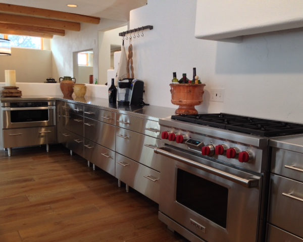
Stainless steel is so good it’s worth bringing up twice. Everything looks great in stainless steel – the sink, the appliances, the countertops, maybe even the cabinets. You don’t see many stainless steel cabinets in homes, but they’ve got a sleek industrial look that blends beautifully into the modern kitchen.
White
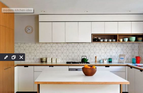
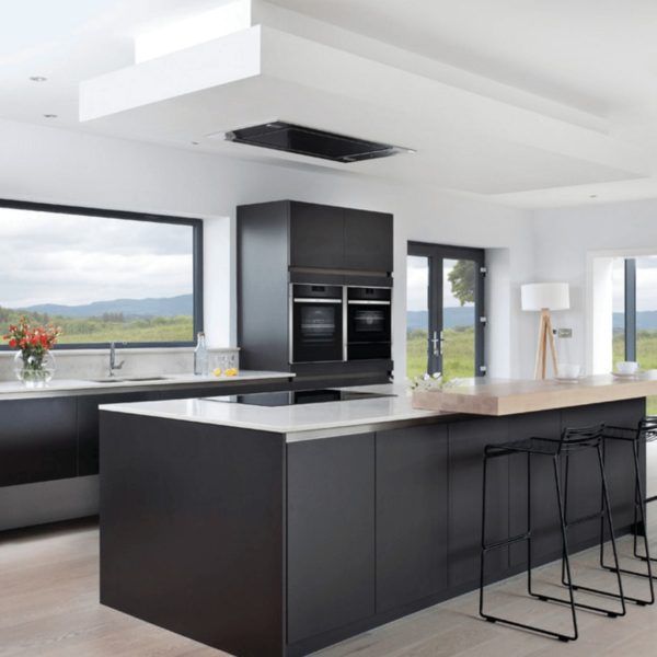
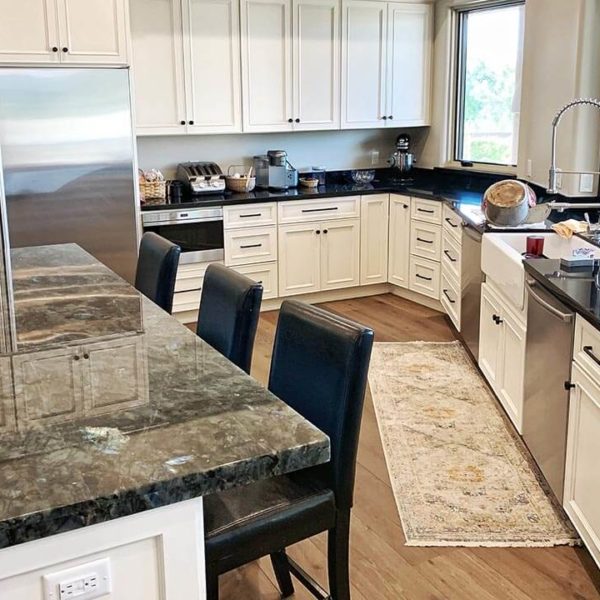
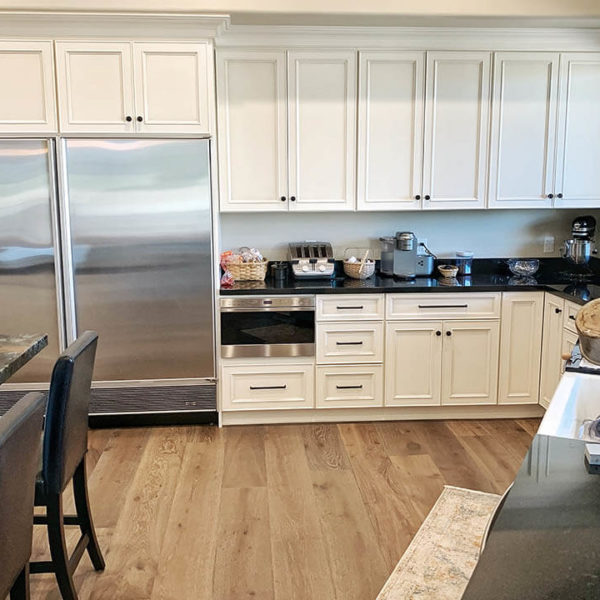
While America embraced color in the Mid-Century Modern style, the classic modern look is white and gleaming. Check out some white cabinets or white countertops for your Modern kitchen. White isn’t the only option, though. Other neutral colors like black and gray also fit nicely into the Modern look. Just stay away from the earth tones.
If your style is more Mid-Century Modern, get some bright color in there too. Red, yellow, and green are classic choices that add flair to contrast the neutral colors. As before, stay away from the earthy browns that imitate natural materials.
Horizontal Lines
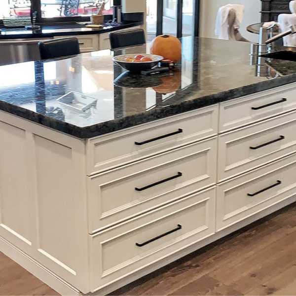
The utility of your kitchen is built around holding things, whether that’s your cabinets, countertops, or table. Echo that functionality in your design with horizontal lines and flat shapes. Modern kitchens are often built with wide drawers and long horizontal pull handles. The grain of a plywood or laminate is a nice way of adding horizontal visual elements too.
Use of marble and stone
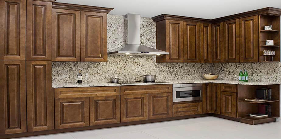
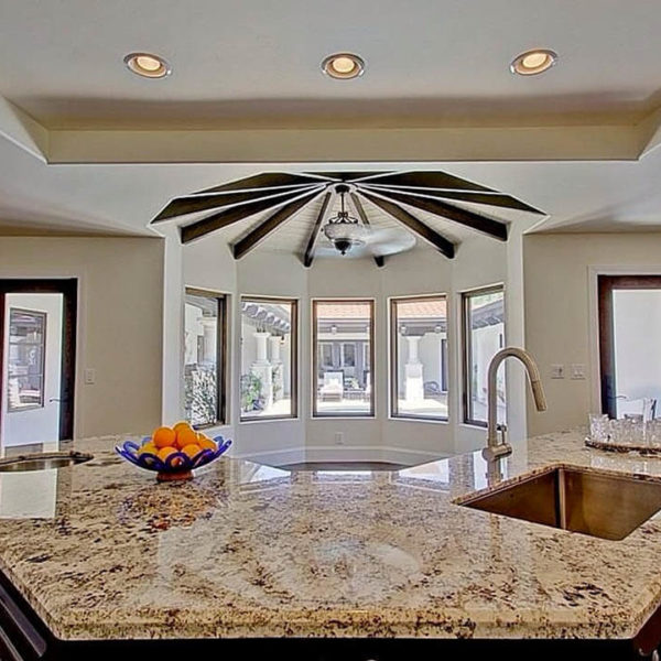
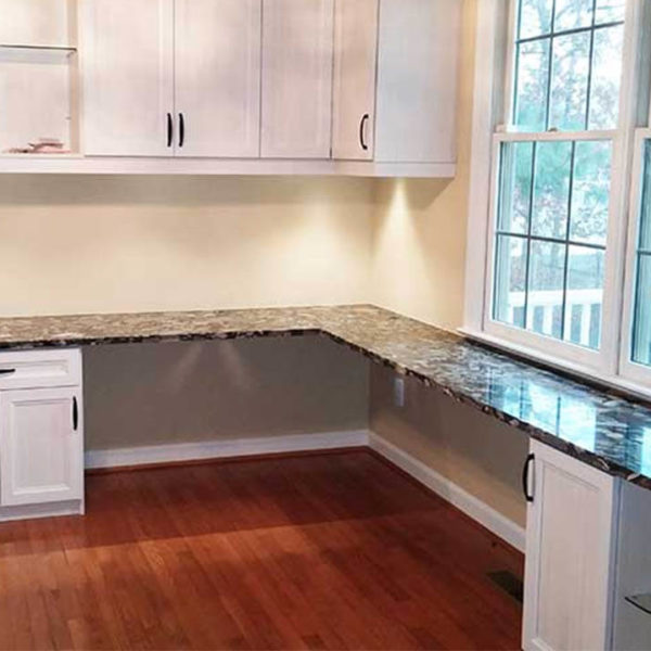
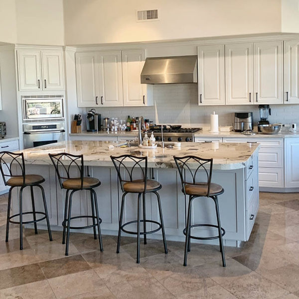
Natural stone surfaces are always a nice touch to keep the continual theme of Modern kitchen design lively. The use of marble and stone doesn’t need to follow special angles since these surfaces represent nature in the raw. The real warmth that gives countertop slabs and kitchen island tabletops is the combined usage of white walls and incoming light. You’ll need to adjust your cabinets to compliment the color of your stone surfaces as well.
The best recommendation is usually neutral earth colors that go with black and white cabinets. These stone surfaces look best when they’re highly polished and have a natural sheen to them. The color of your marble or stone also gives you plenty of choice for selecting cabinet handles and matching sink faucets.
Matching metal surfaces
Once again, touching on the subject of metal surfaces and accessories in your kitchen will all depend on a revolving theme of accompanying colors. This can be accomplished using a sample of your flooring or the kitchen appliances you want to include. Chrome finished are very nice to add for reflecting everything with a mirror-like minimalist approach. You may also like alternative colors such as muted or gunmetal finishes likewise.
All copper and shiny brass surfaces are only going to work if you have similar colors around them. These need to be rich and woody to help them to exist without causing too much attention. The same applies to all knobs, bars, and handles that are attached to your cabinets. As long as there are matching elements that help to distract from standing out and ruining the focal point of your essential kitchen lines, keep these decorative elements well matched.
Open Space & Good Light
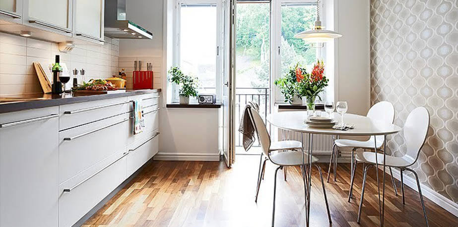
This is not a style that relishes in a cozy place illuminated with the warm glow of the hearth. Take away unnecessary barriers – a Modern kitchen should be open and airy. Get some good light too. Natural light is great, but also include good general illumination and specific task lighting where needed. Don’t overcomplicate the fixtures. This is a good place for some stainless steel and glass.
Cabinets
As mentioned before, there is a lot of talk about color and lines on top of applying a liberal amount of minimalism to your kitchen cabinets. You might want to consider including some other modern design ideas that let you break up too much monotony.
Frameless Cabinets
The frame on a cabinet is unnecessary – strip it away in favor of a frameless design. This looks good, and gives you more room in the cabinet. Frameless cabinets have to use full-overlay doors, which add to the minimalist style by stripping away the boundary between the door and the cabinet.
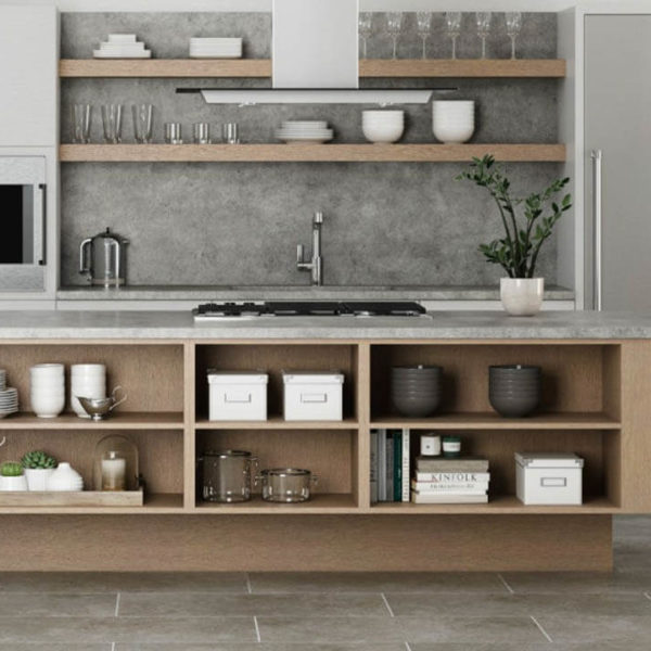
Floating shelves
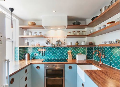
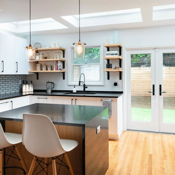
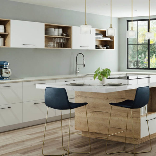
No rule says you should repress sleek lines that give your kitchen simple modern touches. Even a floating shelf is still creating a horizontal line despite anything that is placed on top of these shelves. It does create an area of interest that will allow decorative touches such as flowers in a vase, colored cups, or kitchen spices. Adding a hanging shelf will also distract the eye long enough to create a transition point from one cabinet to another.
Depending on how you’re designing your kitchen, you might want to have open hanging shelves in an area that appears otherwise empty or too small to add another cabinet. While adding a long continuous hanging shelf can make a bold statement if you have a tall kitchen with an upper shelf or floating kitchen shelves. It’s important to mention that supports for floating shelves aren’t always seen so they will appear more streamline on the wall itself.
Colored cabinets
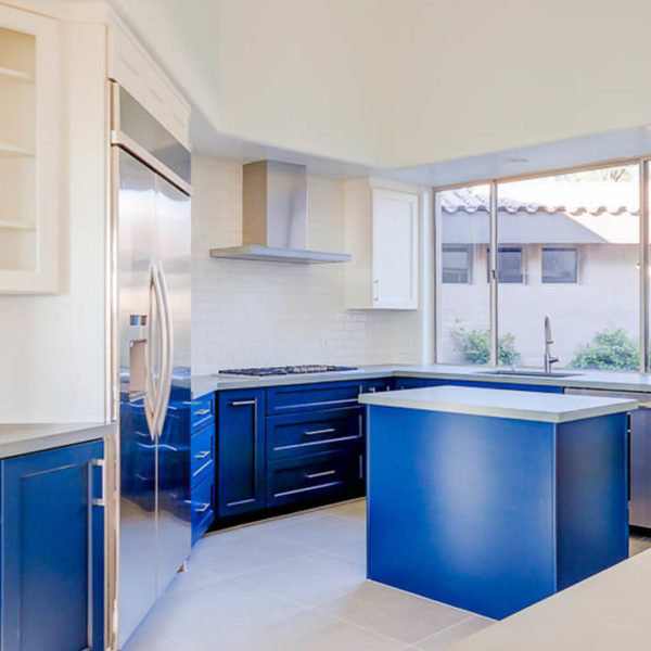
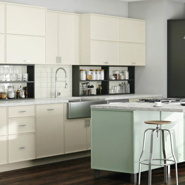
The typical opinion for Modern kitchen colors is always to assume that black or white is the standard selection you can have. Nobody ever ventures out on a limb to talk about the wide range of colors that your kitchen cabinets can feature. Nor do you hear about using bold and bright colors that can liven up a kitchen space rather than having drab color tones. Vivid colors that include red, blue, or green are all perfectly acceptable in this style.
Warmer colors that take on pastel Pantones can also work in this case to accent or break up transitional areas that separate cabinets or simply add visual interest. As long as you don’t break the basic rules of Modern kitchen design, using any kind of color from subtle to bold and bright are an excellent way to make a statement. You want to be careful with overly glossy surfaces that can distract kitchen color and muddy them among any existing finishes.
Open Cabinets
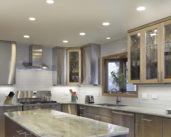
Instead of having doors on your kitchen cabinets, there have been alternatives which include frosted glass, stained glass, and framed glass. There isn’t any harm if you decide to have cabinets with closing doors and are simply open cabinets. It won’t distract much from the lines you’ve created as long as broad horizontal lines are running along a kitchen cabinet section.
What this does do is adding more open space to give decorative freedom to display cups or items you want to add inside your cabinets for display. Especially if you want to show off color within a cabinet with cups that are vibrant or artsy. Even if you decide to have a couple of open shelves, let them blend off into existing cabinets without breaking the flow of dynamic lines that should be present already. Or perhaps a combination fold-up hinging door that allows you access to an open cabinet with a unique garage door-like hinge.
Simple Handles
Think tubular or rectangular bar pulls. They’re simple and easy, with no frills or fancy decorations, and complement those clean minimalist lines of the cabinet. Take a look at different finishes – stainless steel is the straightforward choice, but chrome and brass are interesting alternatives.
Frosted Glass…
If a giant slab of white lacquer is too minimal for your taste, consider one of humanity’s earliest man-made materials and try frosted glass fronts for your cabinets. Frosted glass is functional, in that it covers up the contents of the cabinets, and appropriate to the style. Avoid clear glass, which is more of a Farmhouse look. For an interesting variation, try adding internal lights to your frosted glass cabinets. The glow at night is very attractive. Think factory-style lamps, steel and cast-iron. Just don’t go overboard with this, as too much of an industrial look could start to look more traditional.
But . . . Bright Colors Still Aren’t Off Limits
White cabinets aren’t your only option. If you’re going for that MidCentury look, a few brightly, boldly colored cabinet doors here and there add some nice flair. You could even go all the way and deck out your kitchen in some glossy aqua colored cabinets. Don’t be afraid to incorporate a pop of color.
Maybe Even Ditch The Pulls
Instead of adding hardware that decorates the cabinet faces, consider using finger-grooves to open your cabinets. This creates extremely clean lines, but can be troublesome on the usability front. Make sure there’s a visual cue so you can see where the grooves are at a glance. If you’re looking for something a bit more impressive — while still remaining true to straight clean lines –consider touch-free automatic kitchen cabinets.
Kitchen Islands and tables
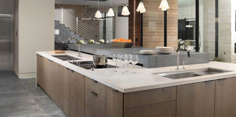
Understandably, the amount of space you have in your kitchen will depend on the overall shape of the kitchen island you’re installing. Then there’s also the impact of light and how it will make your kitchen look larger and obviously brighter. Not every kitchen island needs to be rectangular shaped just because it sticks to modern design rules, giving you the freedom to be more creative within a confined space.
L-shaped islands
Installing an L-shaped island in your kitchen will be a matter of playing a bit of Tetris to get the right angle that fits best into your kitchen. You want to allow existing lines to keep the flow along your walls and cabinet sightlines. In some cases, even adding a U-shaped island will look attractive if you have enough room to play around with already. Since kitchen islands are proving to fit into Modern kitchens more often, don’t just settle for bland trends.
Spice things up with an island shape which allows you to maximize the room that you have without taking away from island storage space you can include. Multifunction islands that are set up to include food prep areas and convenient seating are increasingly popular now. These areas allow your family to sit right at an island just like a breakfast nook, but without feeling like they’re placed in a corner.
Free standing floating wings
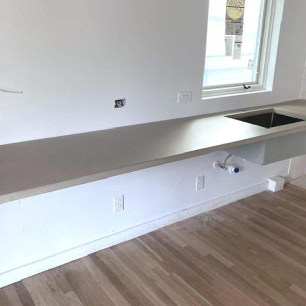
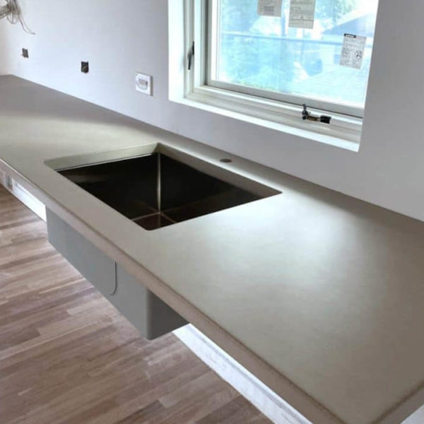
To pull off this type of tabletop you need help to engineer this task so it can take on the type of weight loads expected. And for you to allow a tabletop that emerges from a wall; much like an airplane wing, it does need special construction considerations. The wall that your table wing is attached to will need to be a load-bearing wall that allows your wing to stick out without much support from anything along the entire length.
The visual impact of free-standing tabletop wings is stark and brave, but aren’t always practical without sturdy construction. These are often called floating countertops and can take on the weight of whatever is placed onto these counters. Especially if you want to extend countertops much further than cabinets underneath would otherwise support.
Scandinavian design
We’ve been seeing more influence from Scandinavian design into our homes than ever before. There is something genuine about earthy tones using a blend of wood and natural textures. Much of the emphasis is put on showing off the rich grains of wood mixed within neutral tones that are often minimalist styles. This style is also joined by tall bar stools and chairs that also contain wood , wood cabinetry, and woven mesh textures.
This specific style often includes white walls and cabinets that allow your surrounding furniture to pop out easier. Smaller accents such as decorative cabinet handles and kitchen appliances have no color aside from being chrome so they reflect the surrounding elements that are nearby. This style works incredibly well with hardwood floors that match your wooden shelving, barstools, and chairs.
Sinks and Faucets
Every kitchen will include a sink that needs careful attention to detail but isn’t going to be the centerpiece of your kitchen. It does need to make a bold statement that stands out without drawing attention away from the modern style you’re choosing to follow. Faucets in particular are best when they feature long gooseneck angles that will not stand out as much as a standard faucet tap.
A stainless steel sink is the straightforward choice here. Consider an under-mounted sink to not break the lines of the countertop. Your faucet is going to be one of the highlights of your Modern kitchen – it’s a vertical element that’s always visible in an environment of horizontal lines that conceal themselves. Make sure it’s worth looking at. Try a Fusion-style faucet for an eye-catching industrial look that will work really well when it’s time to do the dishes.
Backsplashes
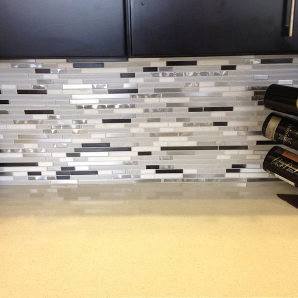
Backsplashes can give your sink area plenty of decorative appeals that shows your personality and style. This is one exclusive area of your kitchen that doesn’t especially need to follow modern styles aside from the creativity that a backsplash says about you and the colors or patterns you enjoy. A backsplash is also perfect to add around the entire parameter of where your cabinets and kitchen counters are running along a lengthy section.
Your kitchen sink will no doubt intersect with this backsplash somewhere within your design but doesn’t immediately need to stand out right away making a sink appear to be a minimal as possible. What any backsplash is meant to do is helping create those sweeping horizontal lines moving a tile backsplash in one continuous direction wherever your kitchen counter is running.
Flooring
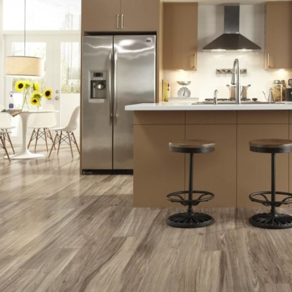
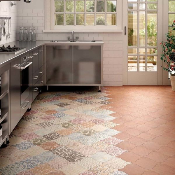
After all, if you didn’t have one, where would you stand? The floor should complement the rest of your design choices. Concrete and tile are good simple choices that use modern materials in a Modern way. White is the norm, as with many things in a Modern kitchen, but maybe take a look at other neutral colors, like black. Laminate or vinyl can work too, and fit especially well in a Mid-Century Modern look.

Modern Kitchen Design
What is a modern kitchen design?
Last updated on January 15th, 2025 at 07:56 pm
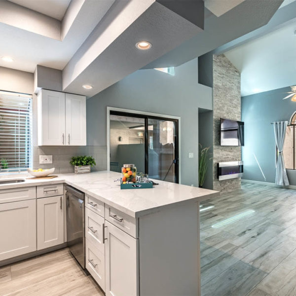
A modern kitchen design is characterized by a clean, minimalist aesthetic and the use of industrial accent pieces coupled with minimalist details and ornamentation. It typically features clean horizontal lines, frame-less or full overlay cabinetry, and a monochromatic color palette.
What are the key elements of a modern kitchen design?
Last updated on January 15th, 2025 at 07:56 pm
The key elements of a modern kitchen design include flat panel cabinetry that hides clutter, elongated hardware on doors, new and often stainless steel appliances, and open floor plans.
What materials are commonly used in modern kitchen design?
Last updated on January 15th, 2025 at 07:56 pm
Stainless steel, concrete, glass, and natural stone are a few of the commonly used materials in a modern kitchen design. Tile is another key material and is usually used for backsplashes and flooring.
How does lighting play a role in modern kitchen design?
Last updated on January 15th, 2025 at 07:56 pm
Lighting is a crucial element in modern kitchen design, as it can be used to create a bright and airy atmosphere, as well as to highlight the clean lines and modern elements of the space.
How can I incorporate storage into a modern kitchen design?
Last updated on January 15th, 2025 at 07:56 pm
Organized cabinetry that has plenty of storage space and drawers is a must in this kind of design. Clutter free is the goal, so storage is super important. Floating shelves, pull-out drawers, magnetic knife holders and built-in organizers are all incorporated whenever possible to create as much storage space as necessary.
What are some common mistakes to avoid when designing a modern kitchen?
Last updated on January 15th, 2025 at 07:56 pm
The biggest mistakes are decorating your space with objects that aren’t necessary in your kitchen. Things like knickknacks are a no-no in modern kitchen design. In fact, anything that sits out or can’t be stored shouldn’t be seen in a modern kitchen. Always think sleek and minimalist with these types of designs.
How can I add a personal touch to a modern kitchen design?
Last updated on January 15th, 2025 at 07:56 pm
The best place to add a personal touch to a design is the back-splash. Using dark blue glass tile as a back splash gives a serious swath of color that can give an overall exciting feel to your otherwise bland kitchen. Using stone or porcelain can also give a personal touch, but be careful and refrain from adding any clutter whatsoever.



No comment